$17.87
Original: $59.57
-70%Kris Sowersby – The Art of Letters—
$59.57
$17.87The Story
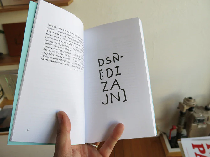
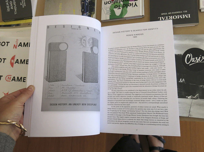
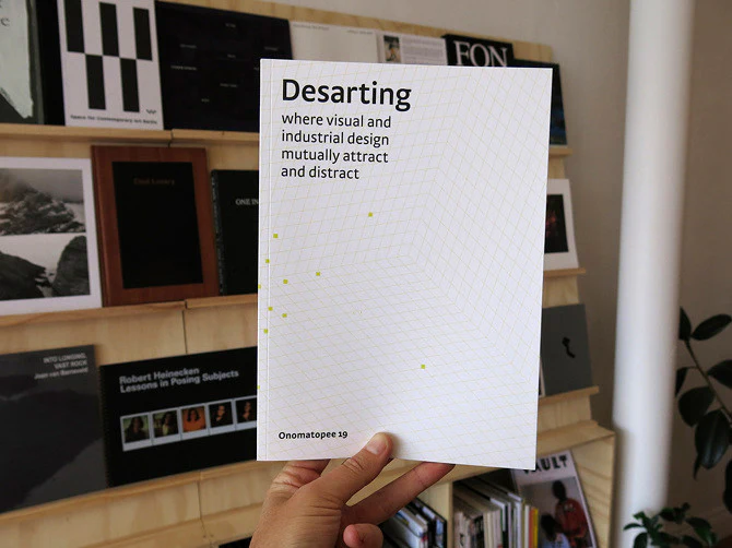
A visual feast of letterforms celebrating one of the world’s leading type designers, Kris Sowersby: The Art of Letters explores letters as art, form and language. While a typeface is a well considered set of many elements, if one removes the context of language systems and alphabets, each character may be viewed as a singular abstract drawing, as art in their own right. As presented in this book, it allows us to re-see, or to see for the first time, their individual form and function.
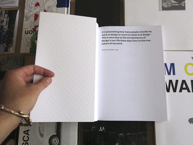
There is no definitive form of the alphabet. The alphabet is a concept made concrete through countless written and designed letterforms; the alphabet is not defined by a single typeface but expressed through all of them. There’s sets of rules, largely unwritten rules, of how a typeface is put together, about relationships between letterforms and between styles. – Kris Sowersby
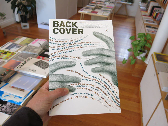
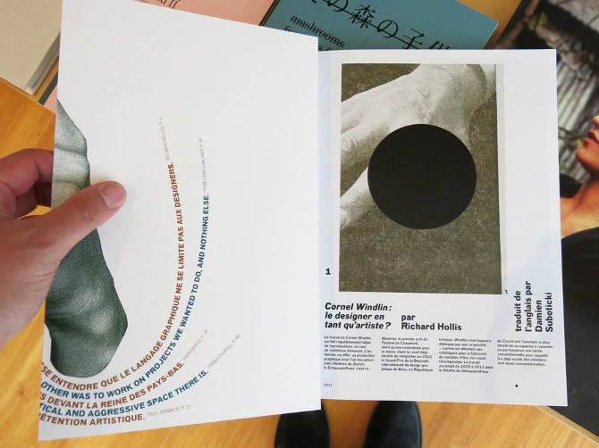
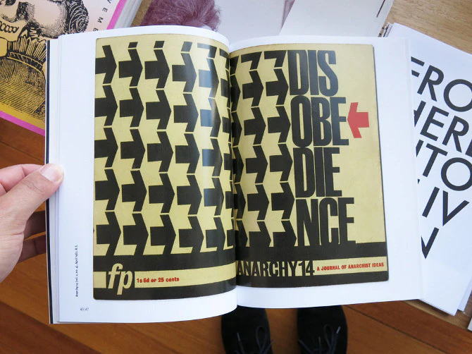
Printed one per page in black on cream paper, the publication features over 750 large character illustrations selected from Klim typefaces including Calibre, Domaine, Founders Grotesk, Heldane, National, Signifier, Söhne and Untitled. The volume features a fascinating essay titled ‘What we read when we see’ by graphic designer, writer and educator Paul McNeil and a foreword by Formist publisher and designer Mark Gowing.
Kris Sowersby: The Art of Letters is finished with black-edged pages and the dust jacket features gold foil-stamped custom typography. Sowersby and Gowing collaborated on a custom typeface used to typeset the book. Inspired by the rich history of rotunda typefaces, its use is exclusive to the publication.
800 pages, 15 x 21cm, softcover, Formist (Sydney).
There is no definitive form of the alphabet. The alphabet is a concept made concrete through countless written and designed letterforms; the alphabet is not defined by a single typeface but expressed through all of them. There’s sets of rules, largely unwritten rules, of how a typeface is put together, about relationships between letterforms and between styles. – Kris Sowersby
Printed one per page in black on cream paper, the publication features over 750 large character illustrations selected from Klim typefaces including Calibre, Domaine, Founders Grotesk, Heldane, National, Signifier, Söhne and Untitled. The volume features a fascinating essay titled ‘What we read when we see’ by graphic designer, writer and educator Paul McNeil and a foreword by Formist publisher and designer Mark Gowing.
Kris Sowersby: The Art of Letters is finished with black-edged pages and the dust jacket features gold foil-stamped custom typography. Sowersby and Gowing collaborated on a custom typeface used to typeset the book. Inspired by the rich history of rotunda typefaces, its use is exclusive to the publication.
800 pages, 15 x 21cm, softcover, Formist (Sydney).

Details & Craftsmanship
Every detail has been carefully considered to bring you the perfect product.

Details & Craftsmanship
Every detail has been carefully considered to bring you the perfect product.

Details & Craftsmanship
Every detail has been carefully considered to bring you the perfect product.

Details & Craftsmanship
Every detail has been carefully considered to bring you the perfect product.

Details & Craftsmanship
Every detail has been carefully considered to bring you the perfect product.

Details & Craftsmanship
Every detail has been carefully considered to bring you the perfect product.

Details & Craftsmanship
Every detail has been carefully considered to bring you the perfect product.
Description
A visual feast of letterforms celebrating one of the world’s leading type designers, Kris Sowersby: The Art of Letters explores letters as art, form and language. While a typeface is a well considered set of many elements, if one removes the context of language systems and alphabets, each character may be viewed as a singular abstract drawing, as art in their own right. As presented in this book, it allows us to re-see, or to see for the first time, their individual form and function.
There is no definitive form of the alphabet. The alphabet is a concept made concrete through countless written and designed letterforms; the alphabet is not defined by a single typeface but expressed through all of them. There’s sets of rules, largely unwritten rules, of how a typeface is put together, about relationships between letterforms and between styles. – Kris Sowersby
Printed one per page in black on cream paper, the publication features over 750 large character illustrations selected from Klim typefaces including Calibre, Domaine, Founders Grotesk, Heldane, National, Signifier, Söhne and Untitled. The volume features a fascinating essay titled ‘What we read when we see’ by graphic designer, writer and educator Paul McNeil and a foreword by Formist publisher and designer Mark Gowing.
Kris Sowersby: The Art of Letters is finished with black-edged pages and the dust jacket features gold foil-stamped custom typography. Sowersby and Gowing collaborated on a custom typeface used to typeset the book. Inspired by the rich history of rotunda typefaces, its use is exclusive to the publication.
800 pages, 15 x 21cm, softcover, Formist (Sydney).